Snackpass Redesign
A redesigned SnackPass experience, optimizing convenience and efficiency for busy students through seamless group ordering and real-time order tracking.
My Role
UX Designer, Full stack product Designer
Timeline
8 weeks(2023.6 - 2023.9)
Project
Self-initiated
Tools used
Figma, Miro, Procreate
Project Overview
The redesigned Snackpass enhances the ordering experience for busy students with quick group orders for school communities, an intuitive decision-making feature, and a real-time camera function for tracking orders at favorite spots. Redefining snack time with speed, convenience, and connectivity.
Design Highlights
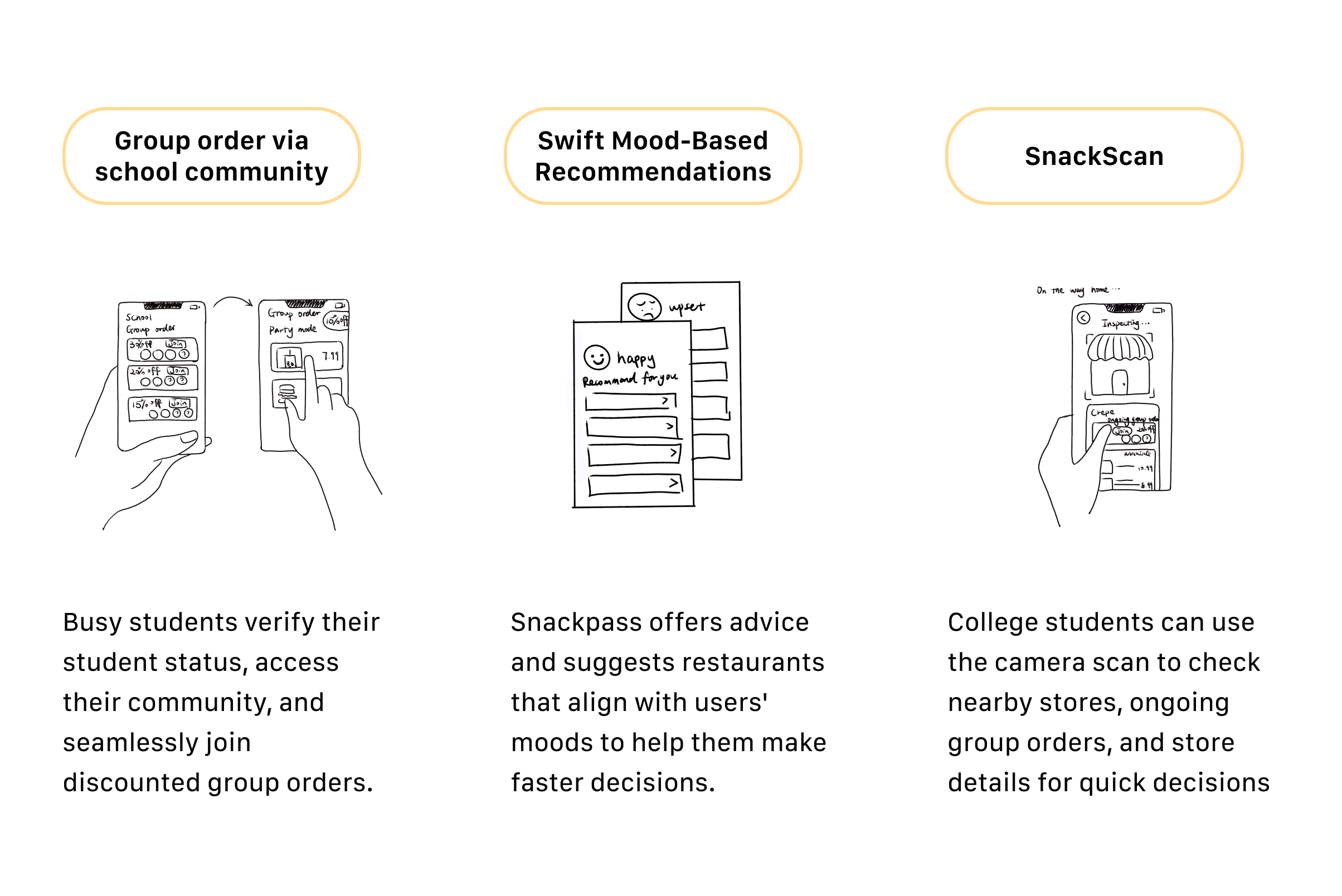
Feature 1: Group Order via School Community
Enables students to access their school community, and join discounted group orders within community seamlessly.
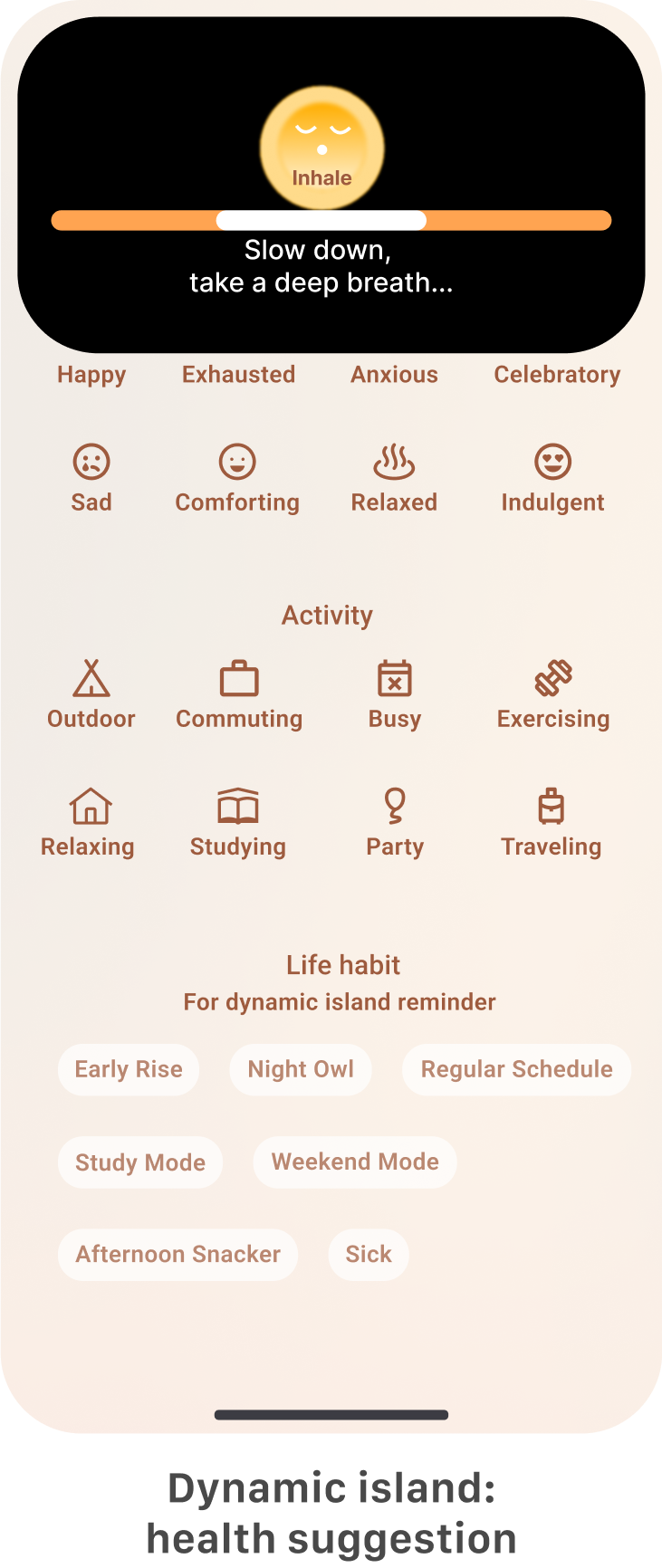
Feature 2: Swift Mood-Based Recommendations
AI-powered suggestions that recommend restaurants based on users’ moods for faster decision-making.
Feature 3: SnackScan
A camera-based tool allowing students to scan nearby stores, check group orders, and access real-time store details.
RESEARCH
Students’ Challenges in Group Ordering, Decision-Making & Navigation
Target users
New College Students – Busy students adjusting to a new environment, looking for social connections and food discounts.
Existing Users – Students with tight schedules, prioritizing quick pickups and convenient ordering to fit their busy routines.
Research Methods
Stakeholder Mapping – Analyzed the existing system to understand key players and interactions.
Contextual Inquiry
My Observation of user’s behavior
Unclear categorization hinders app navigation, complicating restaurant selection.
Inconvenient discount sharing requires users to switch to external chat apps.
The 'Friend Need' page lacks helpful local advice due to stranger interactions.
Absence of recommendations, rankings, or comments poses challenges for users.
Competitor Analysis and Current User Flow Mapping
I synthesized insights from 14 interviews and 10 contextual inquiries to identify user pain points.
Qualitative Research (in-person interview) and summarize product requirements
I conducted interviews with 14 busy college students from various universities, tailoring 18 questions to extract specific insights into their preferences and challenges when using food apps. Each interview lasted one hour, and the findings were organized through affinity grouping to summarize the key insights.
Key Insights from the Research Phase
Discounts, particularly user-friendly ones, are crucial (group orders, return incentives, events). Substantial 20-30% discounts influence restaurant choices.
During exams and finals, students prefer nearby restaurants with fast delivery, prioritizing convenience.
To enhance user engagement, implement flexible, location-independent social features and rewards.
College students often choose food delivery based on factors like anxiety, weather (e.g., heavy rain), academic schedules (e.g., final weeks, weekdays), and social occasions with friends.
How Might We Question
How might we help busy college students increase their community-level engagement onboard with a fast and convenient discount accession process both existing users and new sign-ups so that they can save money & effort in decision-making
USER PERSONA & IDEATION
Both New and Existing Users Want Clear, Convenient Access to Discounts through community
User Journey Map
Brainstorm
I generated 20 creative ideas, conducted affinity grouping based on shared core values, aligned them with the main super pog and product requirements to assess the importance, and then prioritized them accordingly.
My distilled design solution:
Group ordering through school communities, mood-based recommendations, and SnackScan
3 Core Functionalities
INFORMATION ARCHITECTURE & PROTOTYPE
I created a new information architecture integrated with the existing one.
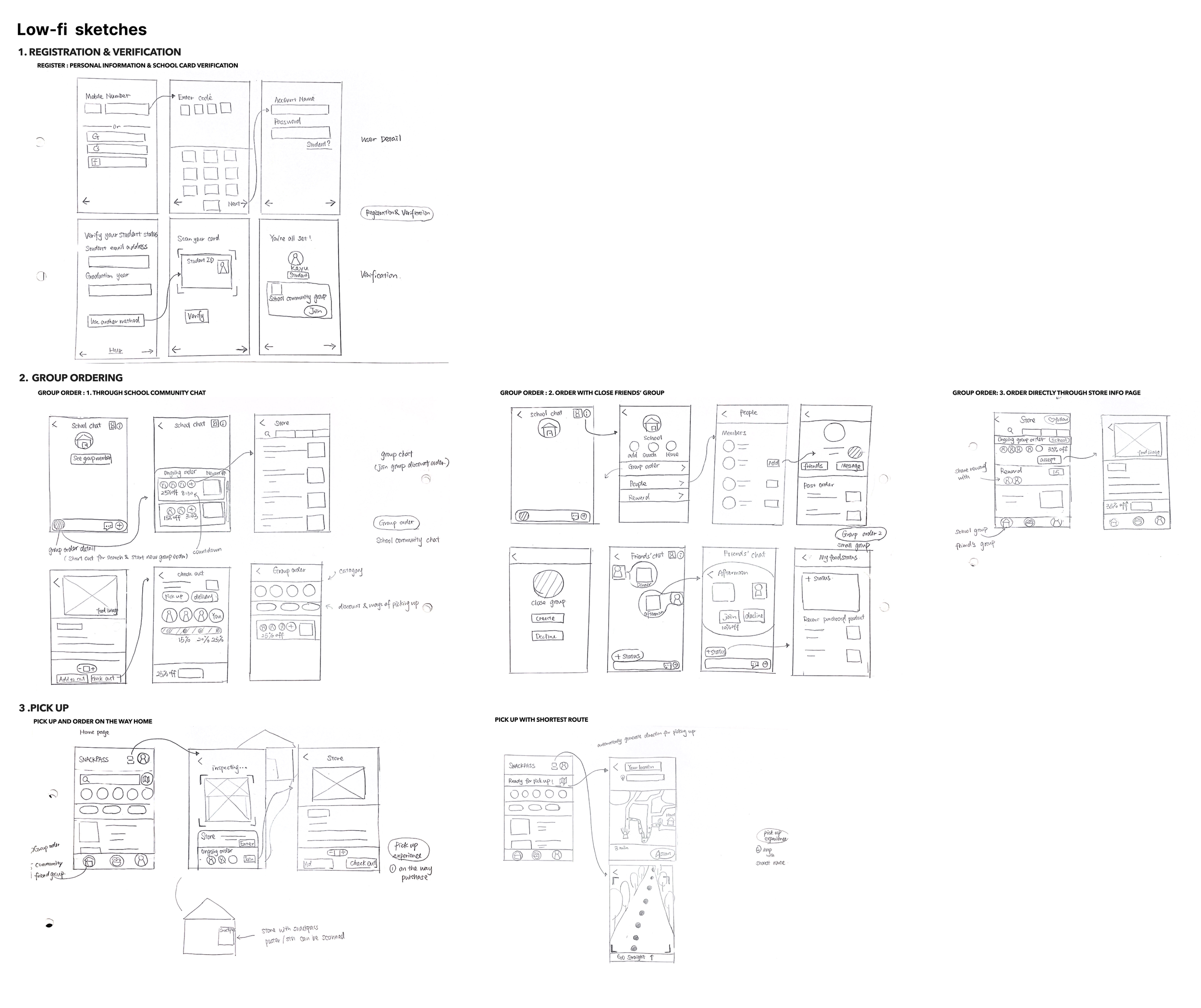
I created multiple low-fidelity wireframes in Figma to evaluate and refine the most effective design solution.
Wireframe Refinement: Four Rounds of Iteration Based on MVP features
Iow-Fi Development
Final low-fi version
DESIGN SYSTEM
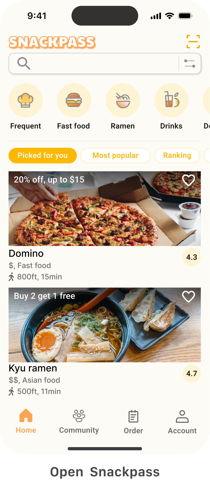
Rebranded to a warm, appetizing yellow-orange style.
I redesigned the color palette, opting for yellow to create a warmer and more appetizing feel, aligning with psychological principles. Blue, the former color, is known for its calming effect, potentially suppressing appetite.
FINAL DESIGN SOLUTION
Feature 1: Group Order Via School Community
Feature 2: Food Mood
Feature 3: Food Scan
Takeaway & Reflection
This project strengthened my research skills for an existing product, starting with market analysis, stakeholder mapping, and contextual inquiry. Conducting qualitative interviews helped me refine questions and identify opportunities to make the product more competitive.
If I have more time, I should conduct pilot testing in a university setting to observe how users engage with group ordering in real life.
Additionally, I can expand the end-to-end experience by integrating group ordering with student meal plans or campus events to drive adoption, and by redesigning restaurant pickup spots to improve efficiency.


